

Is it Time to Bring Back the Bull? (Unlocked)
Bitcoin Data Newsletter Premium

Hello Everyone!
Bitcoin in August broke below healthy bull market supports like the 20 Week Exponential Moving Average.
What we experienced then was a typical, once a cycle occurrence: a bull market fake out.
During this time, Bitcoin makes its first move upwards after doing nothing but going down for a year. This is also when it sets in its first early top, +/- 21 days from July 9th, the date of the second halving.
As I have been talking about on X, the thought that Bitcoin will repeat a 2019 scenario is growing very popular and was what I previously thought was likely.
But as this thought gets overcrowded, and with some recent updates on long-term data, I am shifting bullish.
Yep. Despite the break below supports, I believe there is the possibility the move is already completed. And we’ll be covering it depth in today’s newsletter.
We’ll also be covering some other hot topics: the macro (don’t usually cover this), and the death cross.
It’s time to answer the question: Is it Time to Bring Back the Bull?
This Newsletter Will Cover…
Halving Cycles Theory - Getting Centered
Market Psychology - Actual Recency Bias
The Macro - Time to Stop Worrying About it
Data Analysis - Why it May be Time to Turn the Bull Back On
Projections - How Will This Look?
What Should You Do? - Could it Still Pay Off to Wait?
Halving Cycles Theory
Getting Centered
This is a new section to my newsletter!
After the creation of my Halving Cycles Theory and due to its accuracy, I want now to center my expectations around it.
If you know about the Theory I’m sure you may be thinking, but if everyone is waiting on it how will it play out?
This is why I bring analysis from many different sources to come to conclusions. If the theory failed or many data pieces disagreed, then I would change my stance.
With that in mind, let’s go ahead and take a look!
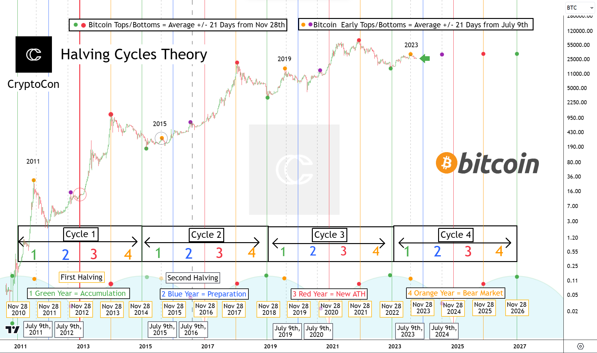
Now let’s have some self-awareness here, I know this chart looks like a laser light show, but I’ll try and make absolutely sure you understand what things mean.
If you’d like the full breakdown of this chart, you can read that here in this X post.
The first early top for the cycle is in, this comes at each yellow dot +/- 21 days from July 9th, in green accumulation year (between green and blue vertical lines, marked 1 in cycle box.)
In the 2011 and 2019 example, the downside from these early tops was quite large. This all makes sense when you look how powerful the moves were up to those points.
2015 had one small rise and a return to the lows.
Another thing I have mentioned, is when Bitcoin bottoms, after these early tops take place (both yellow and purple dots).
4 of 6 have been in August, 2 in November. Which would imply, but of course isn’t certain that either price is already bottomed or will bottom later this year.
With the 2019 image burned in everyone’s mind, the most unlikely scenario becomes a move up in my opinion.
Let’s not take this to the extreme and say the most unlikely scenario is $0 or 1 million tomorrow, we’re talking about which direction is most unexpected, not price.
I want to talk about my expectations from here and into blue year (preparation for new ATHs.) Price is much more structured time wise than you may think.
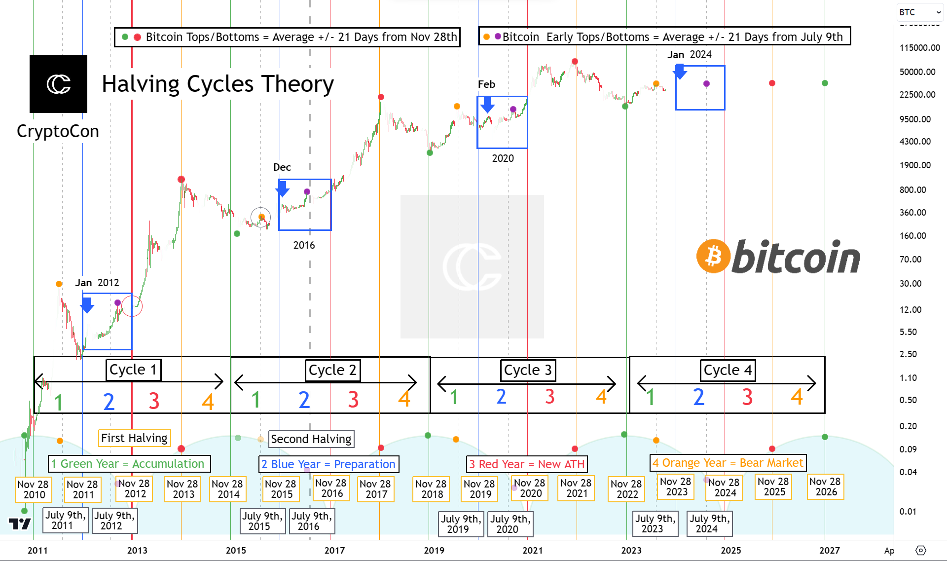
Let’s turn our attention to the blue boxes I have outlined, which hold the price action from the blue years for every cycle.
Try to remove that nasty black swan that happened in 2020 from your expectations. It’s important to realize that is a once in a very long-time occurrence.
If you can do that, you will see that blue years are actually typically, very good performers.
Blue year is when Bitcoin gets ready to make new ATH’s and spends time around the median price. I will define that for you quickly:
Median Price: Half the price of the last all-time high. Fair value for the cycle.
This cycle that price is $34,500. This is around where I expect our next move to be.
The second early cycle top (purple dot) also takes place in blue year. (+/- 21 days from July 9th.)
This seems to be one of only two tops we see in the year. As I have marked with arrows, a local high has always formed earlier in the year, centered around January. This is one of the top dates of our DOGE Model which you can read about in the last Altcoin Newsletter.
The bottoms of these moves come in January or February.
Bitcoin very consistently makes two steps up, the second later in the year, higher than the first.
Using this information, I think I can construct a pretty accurate prediction for the path of price, which we will talk about in the projections section.
I know this was a lot of info, let me sum up what I think based on this:
Bitcoin probably bottomed in August, but if not then November
I think the next local high will be in January
The next bottom from the local high, in Jan or Feb
Next early top: +/- 21 days from July 9th, 2024.
Next low from early top: August or November
We’ll also talk about prices in projections. With our thoughts centered, let’s move on to market psychology!
Market Psychology
Actual Recency Bias
People like to throw this term around a lot, recency bias. Of course, bias is favoring one side of an argument over another, but let’s get the actual definition of recency bias:
Here is a definition copied directly from www.scribr.com:
Recency bias is the tendency to overemphasize the importance of recent experiences or the latest information we possess when estimating future events. Recency bias often misleads us to believe that recent events can give us an indication of how the future will unfold.
You can view that webpage here if you’d like.
Note here how this only applies to what is most recent.
For example, if you were to compare cycles and understand where we are, you could only have recency bias towards 2019 by definition. You are projecting the most recent relevant experience on what you think will happen today.
This I think is what many are doing.
Let’s look at a poll I ran on X:
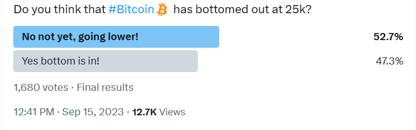
When I asked if Bitcoin was bottomed out just 3 days ago (as of writing) on September 15th, the slightly majority does think that we are going lower.
Some things to keep in mind of course these are short-term thoughts and have probably already changed. But even still for crypto X on a page this isn’t overly bearish, this signals low confidence.
Last newsletter had some wildly interesting results for the coinglass long/short ratio dashboard.
Sentiment was extremely bullish, but shorts (betting that Bitcoin will drop) were insanely high!
I guess what people were feeling was right, considering the latest uptick in price.
Let’s look at the latest data:
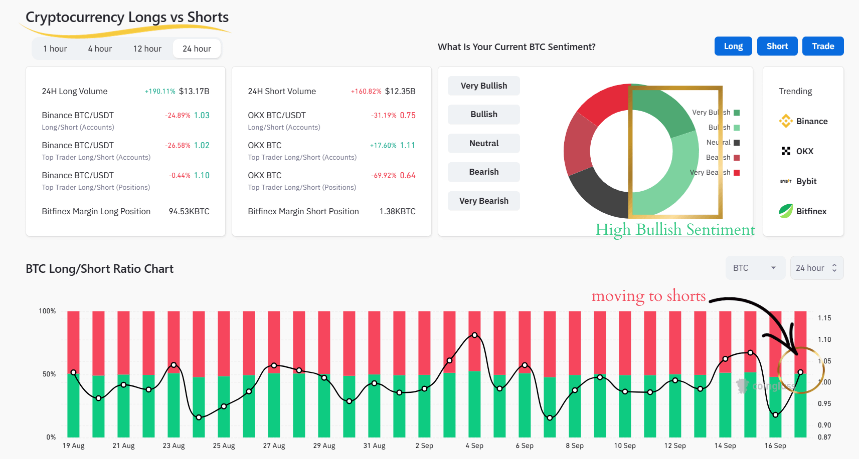
The 24-hour ratio is moving to heavier shorts, and people continue to be mostly bullish. Here is the sentiment breakdown:
Very Bullish: 20%
Bullish: 30%
Neutral: 19%
Bearish: 16%
Very Bearish: 15%
Only just over 30 percent of people are bearish, this is combined still with a higher short ratio, the same combination we had in the last newsletter.
Shorters have not been performing well so far.
Let’s see what fear and greed data has to say:
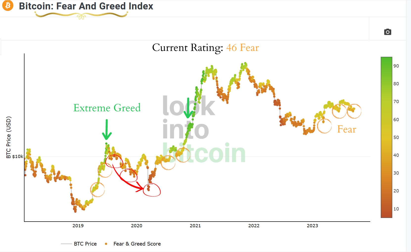
What I see so far on Fear and Greed data is actually, encouraging!
Our current rating on this index is 46/100, or fear. On the most recent dip to prices just under $25,000 this got as low as 40, and I’m pretty sure even lower in real time.
Unfortunately, data for fear and greed sentiment is only available past 2018, it would have been very interesting to see it in the 2015 - 2017 cycle.
This means that our “bull market data” is constrained only to last cycle, with a massive parabolic leap out of the lows, a giant black swan in the middle, and then recovery.
Still, the color shifts seem to be clear. When Bitcoin reaches extreme greed (green arrow), it cools down in extreme fear (red arrow and circles). We have seen neither of those for this year.
So far at least, this looks healthy.
Let’s now talk about market structure:
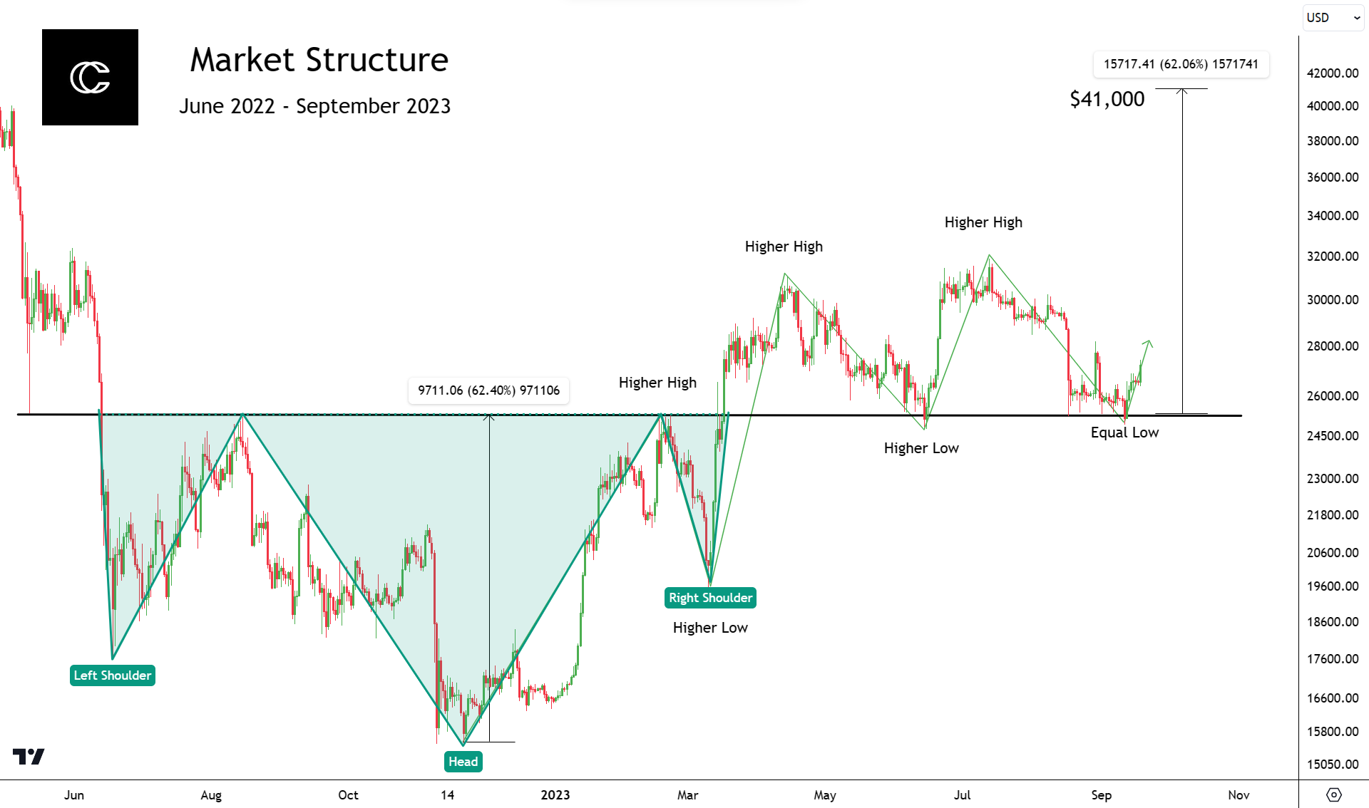
I have to hand it to the market makers; they have created some very confusing market structure here.
Bitcoin throughout 2022 and early 2023 made one of the clearest inverse head and shoulders patterns you could find.
These have two shoulders higher in price, and a head in the middle that is lower.
When they’re upside down like this, it is a bullish pattern. The target is the distance from the neckline (long black line in the center) to the top of the head, but in the opposite direction.
This would give us a price of about $41,000, which of course hasn’t been achieved yet.
Bitcoin has continued to put in higher highs and higher lows this year, in a normal uptrend. Until now that is. We now have an equal low. So no, market structure is not broken, but this does show signs of weakened momentum.
Typically, a retest of the neckline confirms a head and shoulders pattern. Well now we have two…
What to make of it? That’s the question.
I really don’t care for how this market structure looks, and I’ve struggled to find previous examples of this that were also at a similar point in the cycle.
In my opinion, this is the first time Bitcoin has seen something like this.
With that in mind, we need to turn to other data to come to conclusions I think.
Let’s take a look at TOTAL. This is a measure of the top 125 coins by marketcap in crypto, and gives us a little bit different perspective:
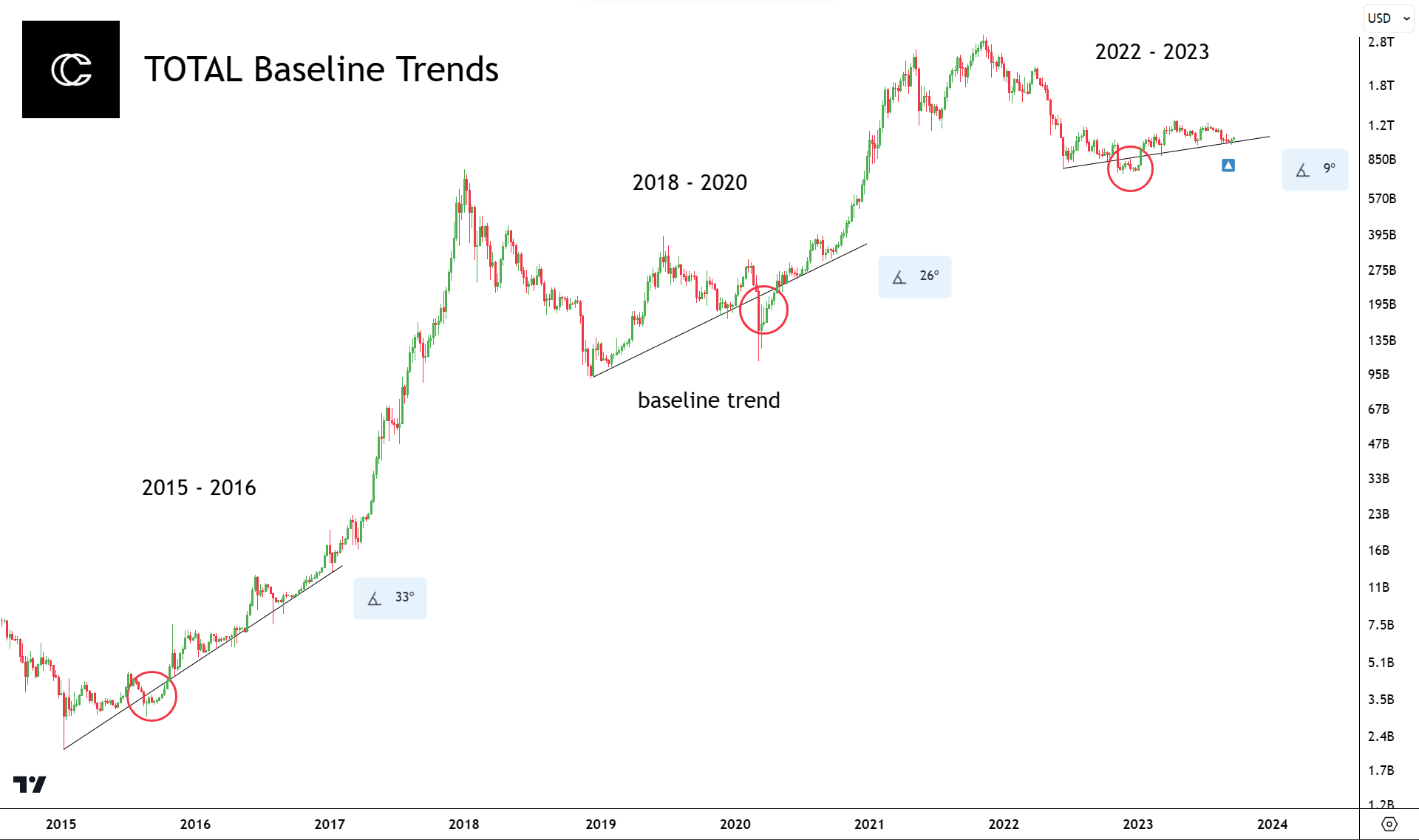
Baseline trends is something I talked about in a recent post on X.
This, being on TOTAL, gives a similar but slightly different perspective.
Like on Bitcoin, each trend lasts through the middle of the cycle at a reasonable angle that can be sustained.
Each trend also has one break below, which I have circled in red.
The previous two as you might have noticed though, began at the cycle bottom, and the most recent at the Luna crash in 2022.
There are several indicators like the pi cycle bottom and others that would consider that area the bottom, but there are two main reasons I believe this is our baseline trend for the cycle on TOTAL:
The angle measurement
The number of times it has been respected
If you look at the number of times this trend has already been retested (4 as support, 1 as resistance) I think it becomes clear, what other baseline could there be?
There’s also not much lower the angle can go. On this scale it is sitting at 9 degrees compared to the previous 26 and 33 degrees.
This baseline is important, because if the one I have marked is correct, it means that Bitcoin is likely bottomed here.
You will see later that long-term data agrees with this.
And this is for more crypto than just Bitcoin, making it that much more important. There’s not much lower Alts can feasibly go, despite what altcoin minimalists may say. If Altcoins are due to hold up, I think it makes Bitcoin more likely as well.
The Macro
It’s Time to Stop Worrying About it
I want to talk about something that I haven’t talked about in one of our newsletters before, the macro.
I’m sure you’ve heard the comments, “you don’t understand the macro!” Bitcoin has never been in this macro environment.
So, here’s what I’m going to do for you, I’m going to help you understand the macro.
Trust me, I get it. It’s easy to fall straight into fear with this comment because let’s face it, most of us crypto guys don’t look into things outside crypto.
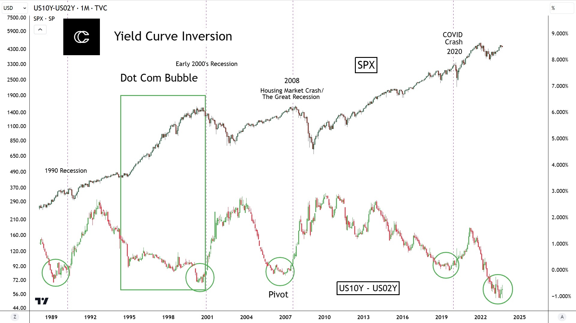
What I have displayed here is one of the biggest worries of the macro community, the yield curve inversion.
This is a comparison of 2 different bond types, 10 years and 2 years. This is vs the top metric, the SPX (the S&P 500) a measurement of the top 500 performing companies.
When the 2-year rate surpasses the 10-year, (bottom metric pivots) it can signal that investors are not confident in the market and are flocking to long-term locked in gains, which drives their rates down.
When this happens, it has had an extremely accurate history of predicting recessions. I have marked these examples with the purple dashed vertical lines. The “pivots” that everyone keeps talking about, are circled in green.
When you see this, you can understand the worry, the inversion is more inverted than ever before, and looks teeming for a pivot.
But here’s the caveat, no one knows when that will occur!
Look at the dot com bubble example, this “looked” ready to pivot for 5 years, yet this was one of the most explosive growth times in history.
These an even longer tack record than I’ve presented here, back to the 60’s.
There’s been a clear pattern, recessions take place about every 10 years. You can see that on this chart in the 90s, early 2000s, late 2000’s and 2020.
But could it be that the 2020 COVID crash satisfied this pattern?
Will the pivot cause a recession? Probably. It has been very accurate throughout history. Do we know when it will come? No, and that’s that.
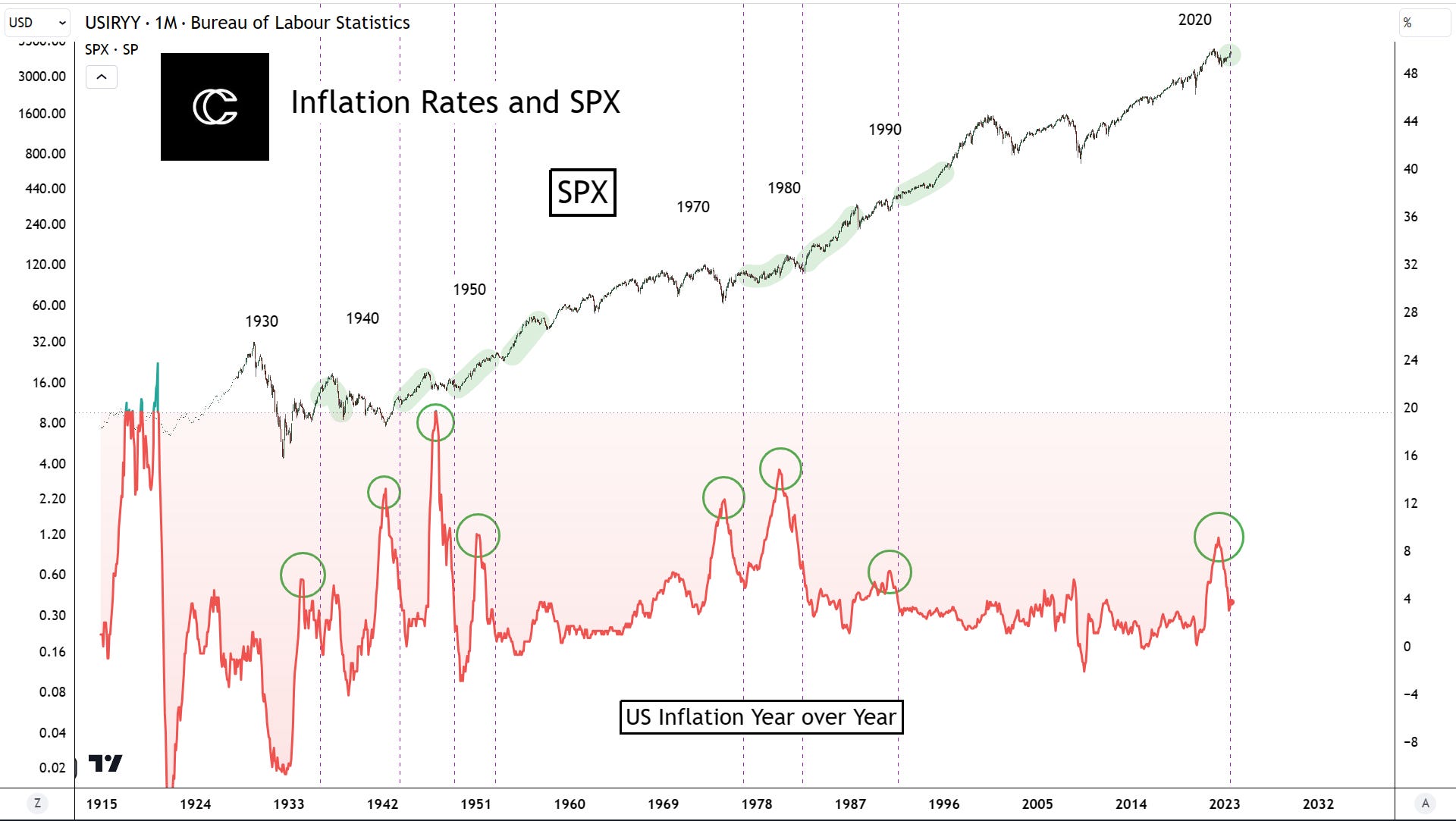
Inflation rates are high, because of the excessive spending of governments during the perceived time of crisis in 2020.
Ok… and?
You can come up with all kinds of stories as to why this is bad, but let’s look at the facts.
Have we seen this before? Yes.
Has it been more than it currently is? Also yes.
Inflation rates have actually come down significantly from their peak from over 9% to now almost 4%.
I have drawn vertical dashed lines to show our relative position to previous instances of this. Notice anything? No recession.
Overwhelmingly, up up and away. Except for that one time during you know, the Great Depression.
Don’t let people scare you with the term “macro”. Or yield inversion, or interest rates.
No one knows when the curve will invert, high interest rates happen sometimes, and they’ve been higher.
Bowing to fear that you don’t understand will keep you from being successful.
Now that that’s taken care of, let’s turn back to our on-chain data analysis for Bitcoin!
Data Analysis
Previously, we have looked at several metrics of interest for the “bottom after the bottom”.
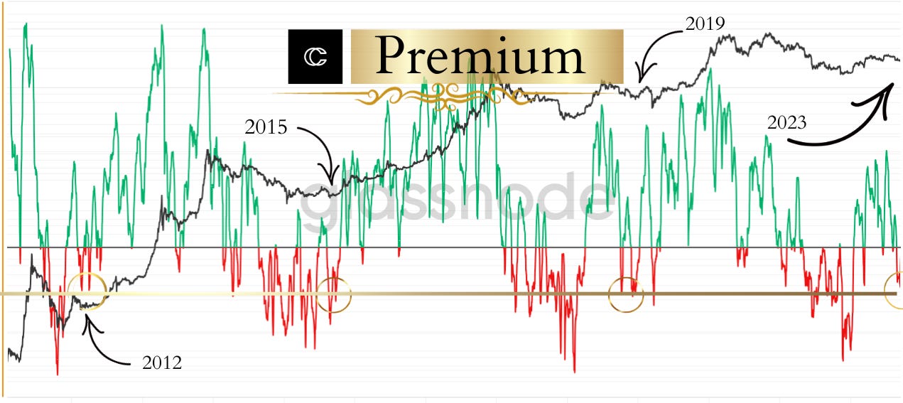
One of them is displayed in today’s thumbnail! It’s looking promising:
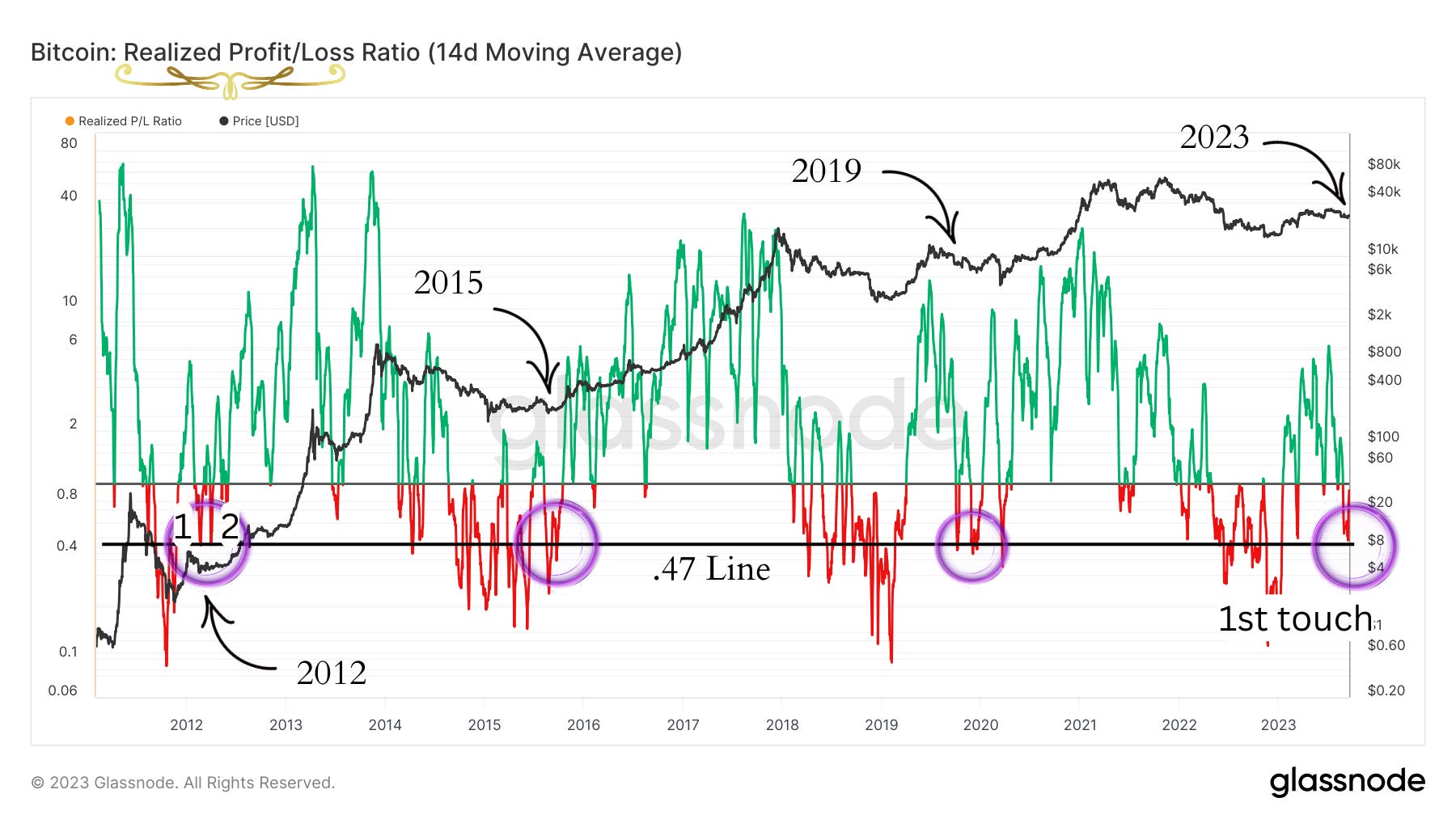
The realized profit/loss ratio is a measurement of how much profit and loss investors have actually sold.
Each bull market fake out has bottomed in relatively the same place, with 2015 having a looser respect: the .47 ratio value.
Each of these instances also experienced a double bottom on the metric, with two touches of the line. The second touch confirms the bottom.
We have now reached the line, with the very first touch.
In 2019, the second touch was lower in price, but not so for the first two.
Be sure to check out a couple of my recent posts, the Elliot Wave Oscillator and the Chop Zone. This adds to the conclusion of this indicator. You can view both of those on our premium indicator page by clicking this button:
Let’s look at some other data:

Like the Realized Profit/Loss ratio, Long Term Holder MVRV also has a frequently retested support line around this time in the cycle. The value is around 1.3.
The most recent example of this is 2023 is now undergoing its second retest of the line, which I must be honest isn’t something I like to see much, but we did see something similar in 2016, where Bitcoin struggled to get over the line multiple times.
This retest is not extremely precise, and the metric is slightly below the line shown, but the overall confluence remains.
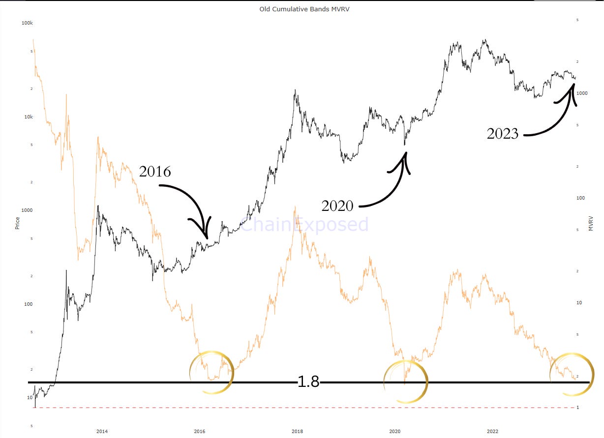
The 2-Year-Old-Cumulative bands MVRV has now reached the exact same point as the bottom of the first move out of the lows in 2016, and slightly higher than the 2020 COVID crash.
At first, I thought this indicator may be lagging given its bottoming points well after the actual bottom but take a look at how well the tops line up!
While this metric could continue decline, I don’t think it’s likely to go lower.
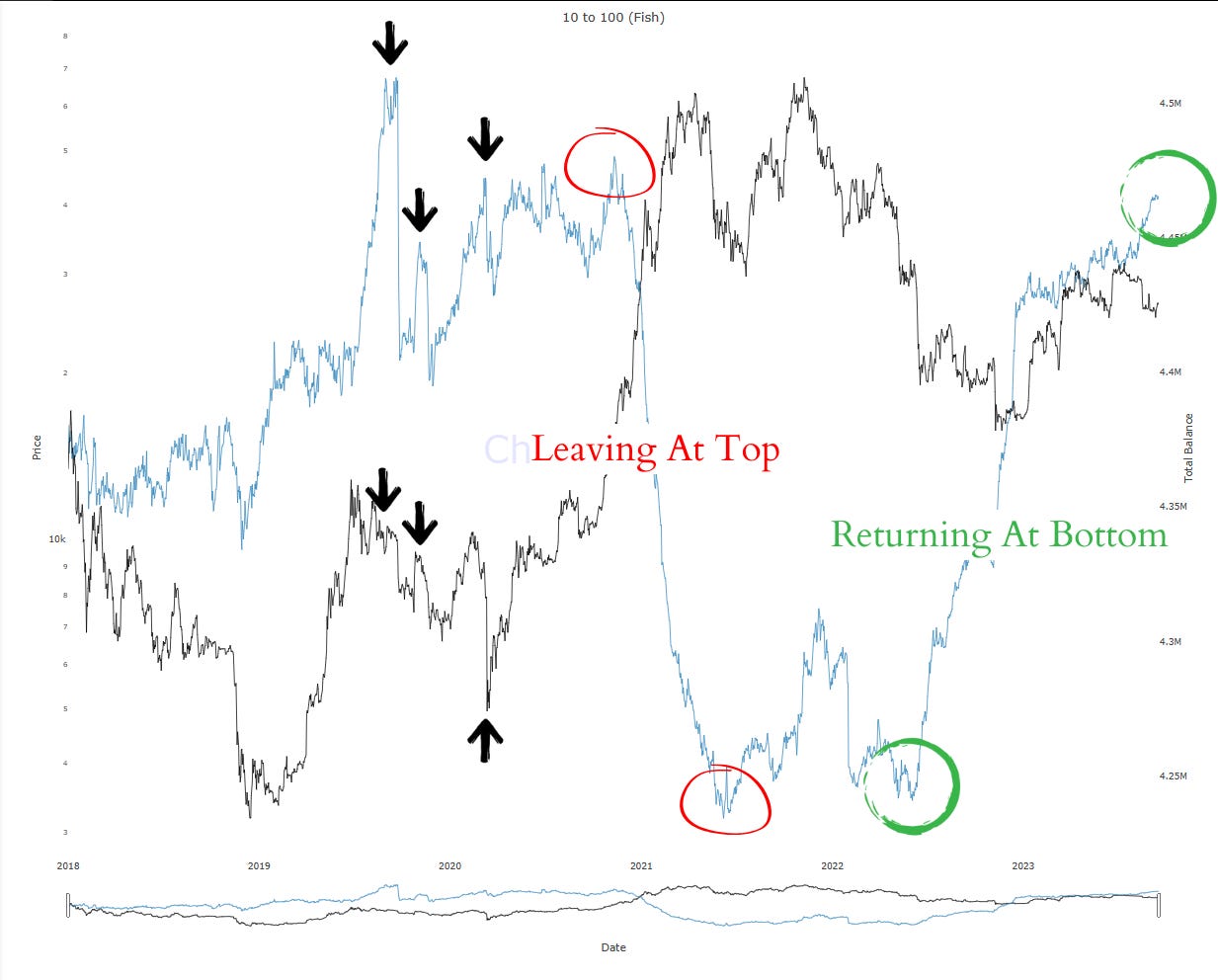
Our smart investors for the cycle are absolutely surging, they are heavily buying this dip.
If you don’t know why I’ve labeled them the smart investors, take a look at those rapid declines and rises at the top and bottom.
I don’t want to say this rise is a bottom signal in and of itself though, the black arrows mark times in the previous cycles where these investors rose in number, while Bitcoin continued to drop from the cycle mid-top in 2019.
But, if they’re as smart as they have been recently, this is a good sign.
If you want to copy them, you’d be buying here.
For the last observation, I wanted to take a look at the death cross many are worried about:
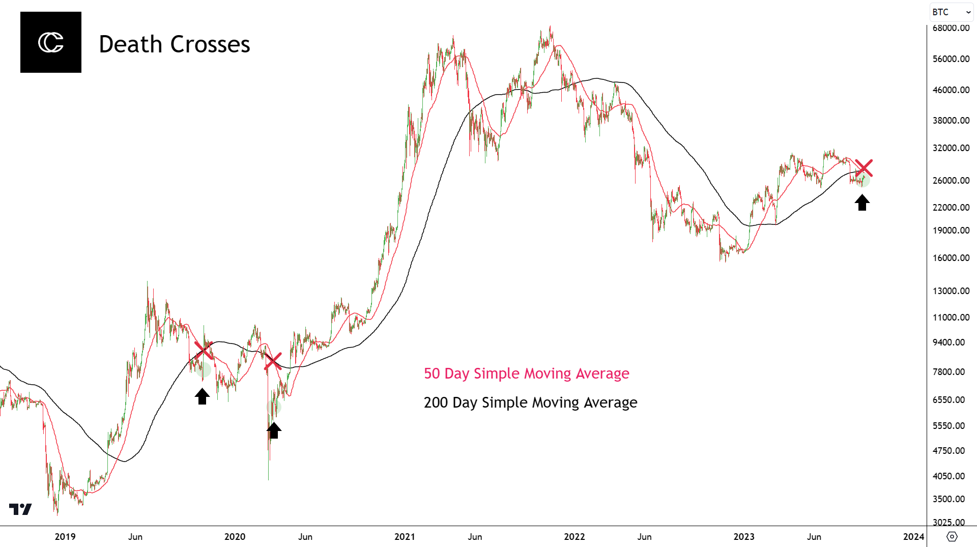
To make fair comparisons, I wanted to look at the “death crosses” that have occurred mid-cycle.
This particular cross is made up of these two moving averages: The 50 and 200 Day Simple Moving Averages.
You may have heard it said that Bitcoin typically rallies into these crosses, this is true. You may have also heard that this usually forms a lower high, this is only true if you are making the comparison on all death crosses including the ones that come during bear market downtrends.
The first cross in 2019 made a lower high, but the 2020 black swan death cross did not.
I think it’s important to note that you can combine any particular moving averages that could be crossing to the downside any particular day and call it a death cross. These particular MAs are watched a bit more which gives it a little more importance.
Let’s look one other example that came in the cycle before last:
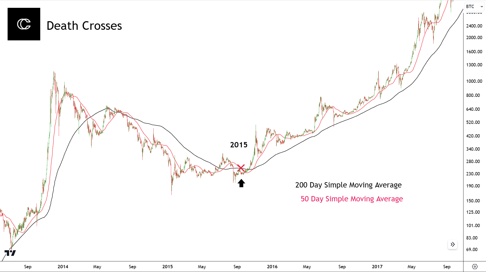
The only other mid-cycle death cross occurred during 2015. Guess what was going on then? The bull market fake out.
Notice how this did not create a lower high, and actually told us when the bottom occurred.
These are the only fair comparisons I believe you can make. When you’re trying to determine what two moving averages crossing means, it’s important to compare to a similar point in the cycle.
All this to say, nothing to worry about.
Let’s not forget the other “first ever death cross” everyone was worried about earlier this year:
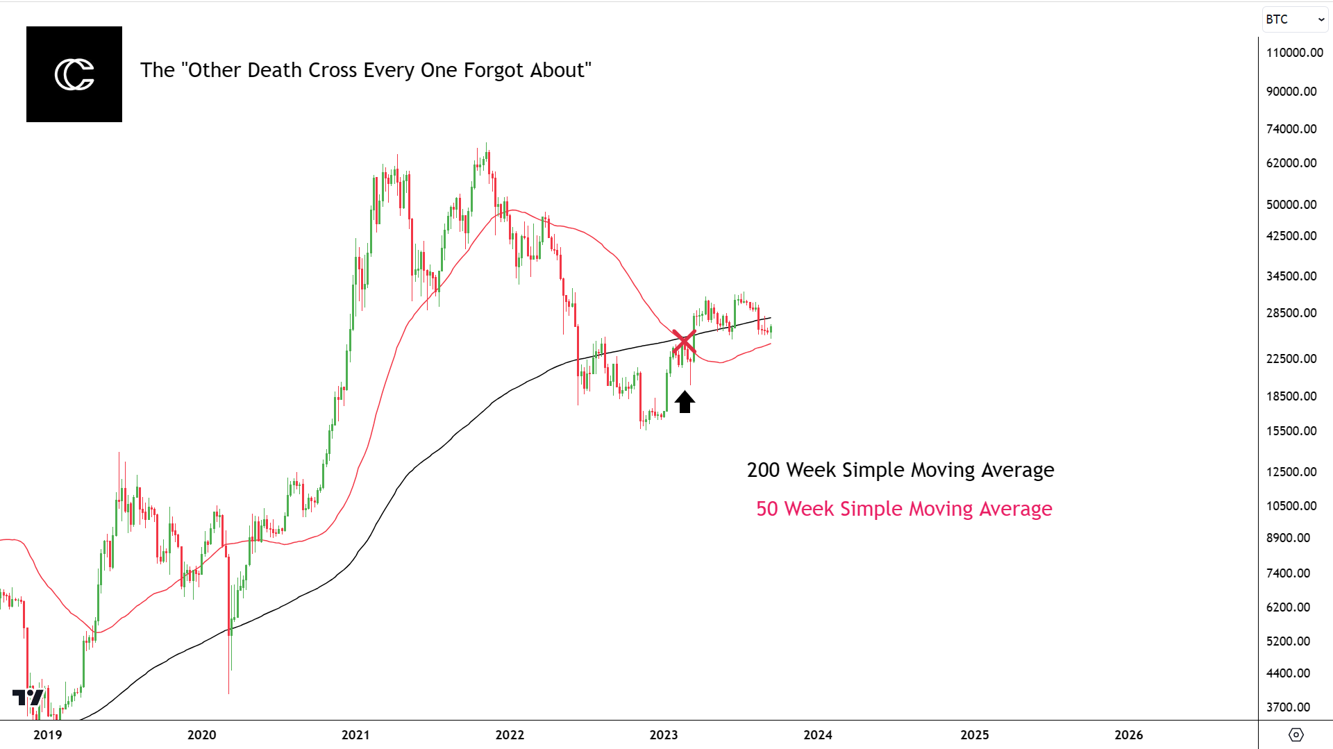
And we can see how that turned out…
Projections
How Will This Look?
Let’s now take a look at what I think price will do up into the cycle top!
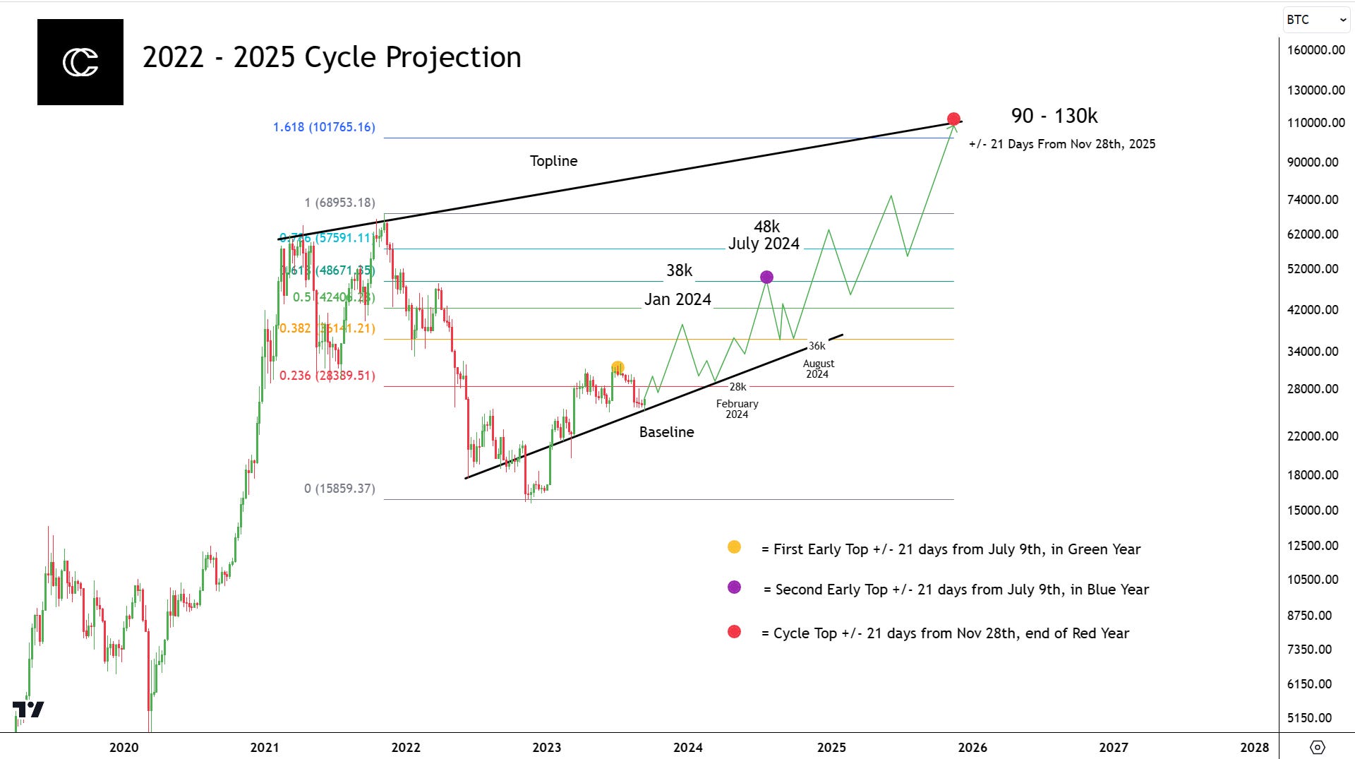
Based on my Halving Cycles Theory, some important Fibonacci retrace and extension levels, and barring any unforeseen events, this is what I think the cycle will look like.
It is mostly the same to my other projections, but slightly more specific with the guidance of my model.
You can see that it includes the same old curve that everyone thinks that everyone is expecting. But I don’t think this time will be any different.
I think price will continue to hold up the baseline I have outlined and proceed to make two tops next year right on schedule.
Here are the events:
Gradual incline into January
The first top in January of 2024 at around 38k
A retrace to the base line at about 29k Jan or Feb 2024
Mostly Sideways price action
A secondary push into 48k to form the cycle mid-top/second early top according to the HCT (Halving Cycles Theory).
A drop to prices at a fib level and slightly above the baseline at 36k and second early top
Curve into new ATHs
Completion around the price target of 90-130k, (I am more so expecting around 100k, +/- 21 days from Nov 28th, 2025.
I am very much looking forward to seeing how this plays out!
What Should You Do?
The what should you do section features our DCA Tools, subscribe to unlock this feature!
In Conclusion…
We covered quite a bit today, from an overview of my HCT, to some current market psychology and even some macro analysis!
I think that maybe it is time for the bull to come back! The best choice is to wait for that reclaim of healthy bullish supports of course.
The HCT says if Bitcoin has not bottomed in August, then November is the Date. Long-term observations I have viewed here, and on X show the possibility that the bottom after the bottom has occurred, and I believe it has.
Stop listening to those Debbie Downer macro people so much and stay positive! Things in the majority of cases will turn out better than you expect if you are patient.
Thanks for reading this edition of the Bitcoin Data Newsletter Premium. Be sure to leave a like if you enjoyed, and any comments or feedback you have!
I hope you all have an amazing week and see you next time!
Best wishes,
CryptoCon
Nice work CC! I'm not much of a TA person so it makes a nice change hearing more about macro , especially you saying don't worry if you don't understand it all-phew what a relief to hear u say that ,half thought I was losing my mind trying to grasp it all-:))
I appreciate the work and imo detail you put into your work for us all to enjoy. Quiet remarkable!
Thank you
About DCA...
Let's say I have 100k. I decided to put in 10k every month. During the next 3 months, we stayed in the 30% range, that is, I invested 3k x 3 (9k) and saved 7k x 3 (21k).... in the fourth month, we dropped to the 70% range. What should I do? invest 7k this month plus the 21k.0.7% k accumulated? I would like an example with real numbers, as time passes, and we change ranges.