

Bitcoin Data Newsletter #3
Bitcoin Continues Sideways... Where Are We Now?

Welcome back Followers, Veteran Subscribers, and Newcomers!
Over the past week for the most part, Bitcoin has gone sideways, continuing to hover around $59,000. There was a considerable spike at the end of the week to 61k, which will likely be the beginning of the end to the consolidation period. I’ll discuss more about what I expect for the short term in the premium newsletter, but things are starting to look up.
With sideways price action, many long term indicator positions go mostly unchanged in only a week’s time. I’ll be talking about a couple that have made noticeable changes.
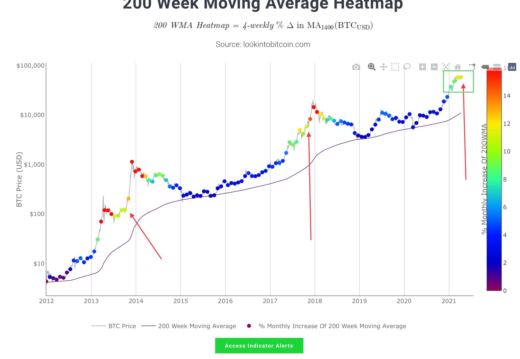
The Bitcoin 200 week MA Heatmap measures how fast the 200 week Moving Average is increasing. When it is increasing too quickly, it can be an area of “overheating” or a good time to sell. This is denoted by the color red which represents a 14-16% Monthly increase of the Moving Average line.
This indicator makes a new dot about once a month, and just printed another on April 9th. This dot was green-yellow indicating about a 11% monthly increase of the moving average. This was also the same color dot as last month, meaning that since this time last month, this indicator has not changed.
We have seen this color dot 2 other times in previous cycles, once on Oct 4th 2013, about 2 months from the top, and again on 27 Oct 2017, about 1 2/3 months before the top. So according to this indicator, Bitcoin is 1 2/3, to 2 months away from a top, which if true would be the very end of May to early June time frame for a top this cycle.
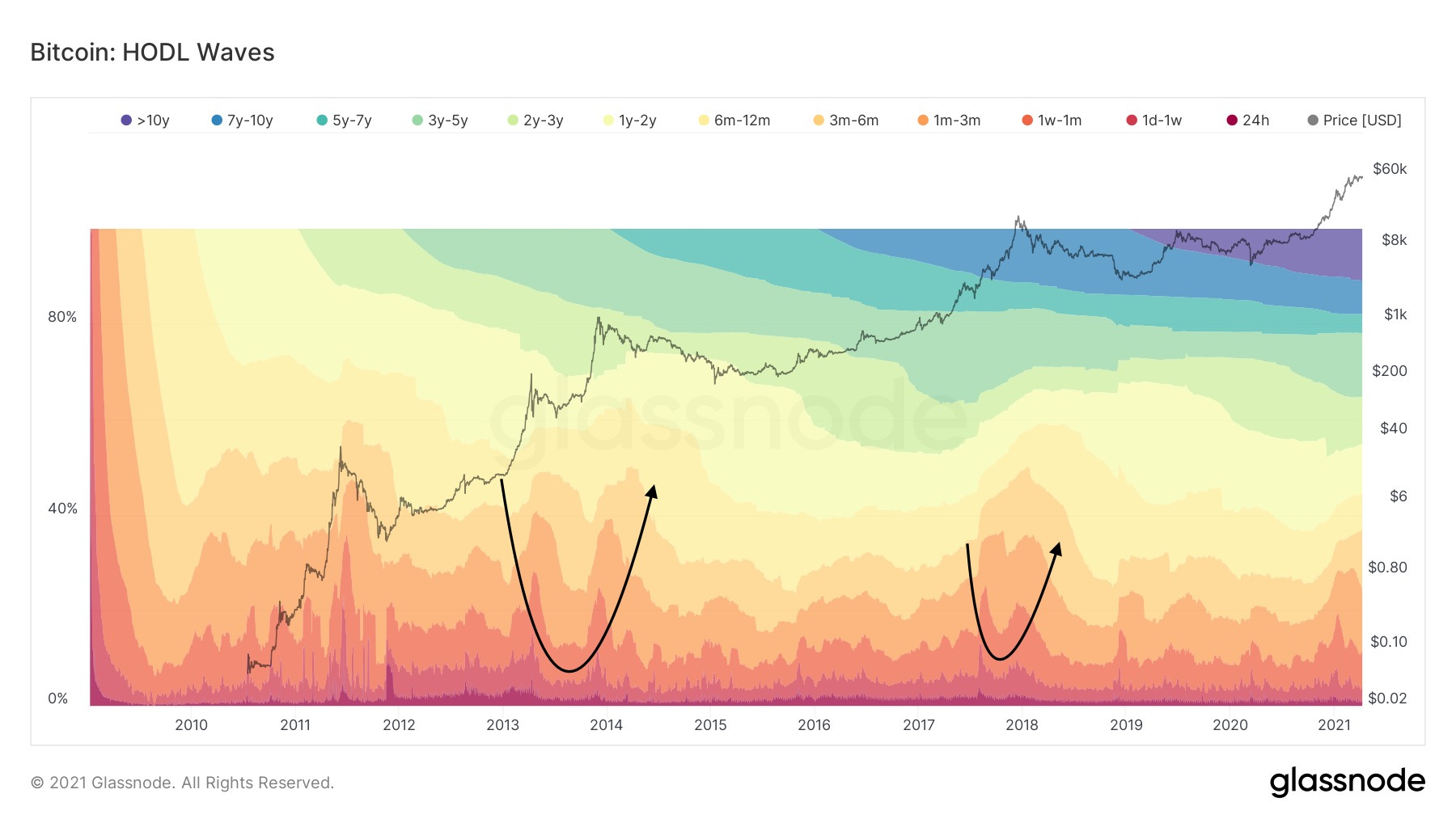
I have mentioned the HODL waves in both previous free Newsletters, and is one of my favorite indicators. This metric shows coins of different ages groups, and their actions, waves moving down = accumulation, up = selling. The arrows show a double top pattern observed in the past 2 cycles. And seems to be forming again currently.
I am comparing this cycle to the 2017 cycle, because it has followed it more closely, using the stair-step like formation up rather than two parabolas with an extended sideways period in between like the 2013 cycle.
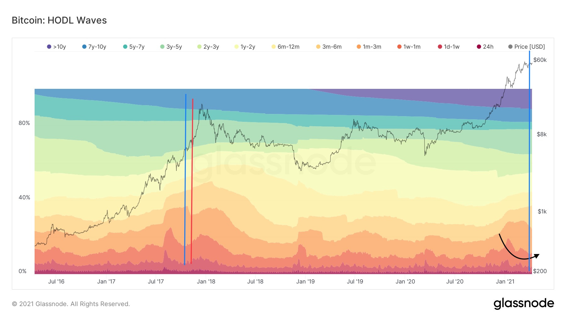
This double top can be useful to determine where we are compared to the 2017 cycle, by watching for the turn around points in the waves. This is the point when a given age group switches from buying to selling, and between the different coin age groups happens at different times as can be seen by the different colored lines.
The blue line signified the point where the 1 week- 1 month age group started selling in the 2017 cycle, on Oct 15th 2017 about 2 months from the top, while the red line showed where the 1-3 month age group started to sell on November 8th 2017, about 1 month and 1 week from the top.
I currently believe the 1 week- 1 month age group has started its transition into sell mode, indicated by the most recent blue line. You can view the slight uptick in coin selling right after, which I am predicting will be the trough of the wave. I think this shift occurred on March 30th, which would put the top about 2 months from that date, if history were to repeat exactly, So around May 30th, confirming what the Heatmap says.
The 1-3 month age group is still in heavy accumulation mode, something that has typically happened nearing the end of the bull cycle. When this wave reaches a turning point, we can imply this may indicate a top is due in about 1 month and 1 week.

The active addresses display a pattern in the 2017 cycle that so far has been lining up very accurately this cycle. This pattern consists of 3 lower highs (red arrows), and 3 higher lows (green arrows).
With the most recent consolidation period, the third higher low has been completed (last green arrow). Assuming this pattern is true again this cycle, would put this cycle at about the same point as Oct 8 2017 (blue circles), 1 month and 3 weeks from the top. This again lines up with Late May this year.
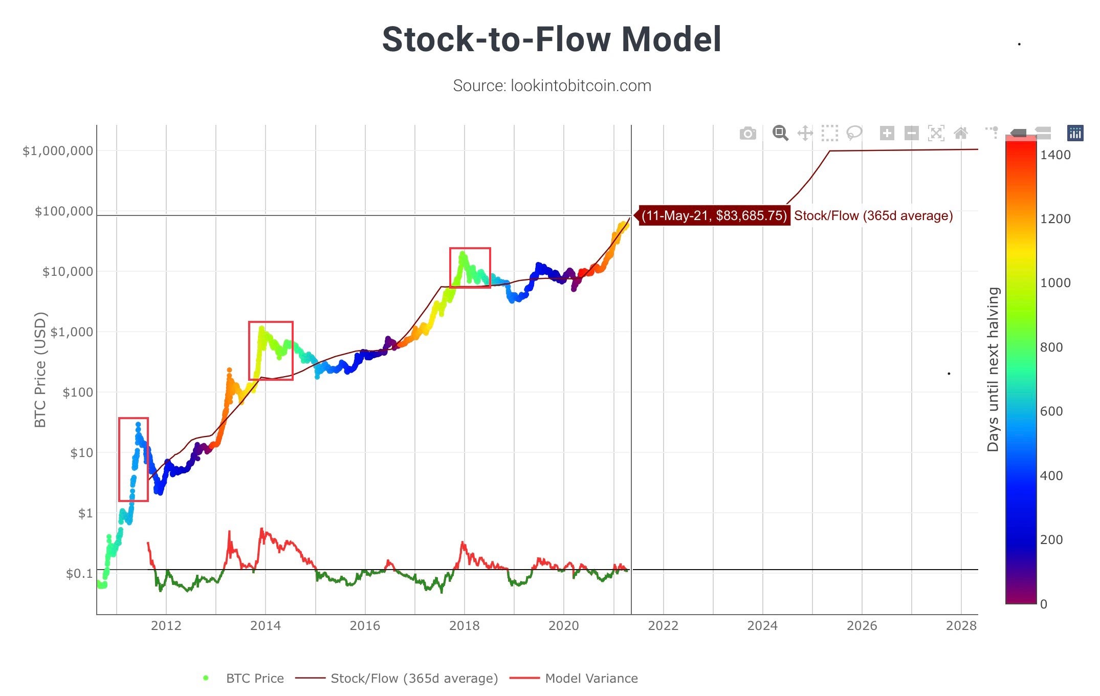
The S2F model is my favorite Bitcoin model, and happens to be the reason I began to explore and be confident that Bitcoin was a good buy in the first place. Since then, the model has tracked price almost perfectly this cycle.
The reason this stands as my favorite model is due to its fundamentals, it tracks Bitcoin’s value based on supply and demand, and implies that whenever supply is reduced (the halving), and demand remains the same price will go up.
Each cycle price has overshot the stock to flow model line, but as you can see by the red boxes, the amount Bitcoin overshoots this line is decreasing. According to this model, the implied bitcoin price is around 84k by May 11th, this is where the curve flattens. There are many claims that this model predicts a price of 288k, this is not true. S2FX implies a price of 288k by 2024, and I do not like that model as much because it is based on other assets scarcities compared to bitcoin, and not bitcoin by itself. However I do think it’s possible that model do comes to fruition close to its time frame, just not in this cycle.
A 110k-130k price target is reasonable/conservative based on this S2F, and would still assume diminished returns as have been in past cycles.
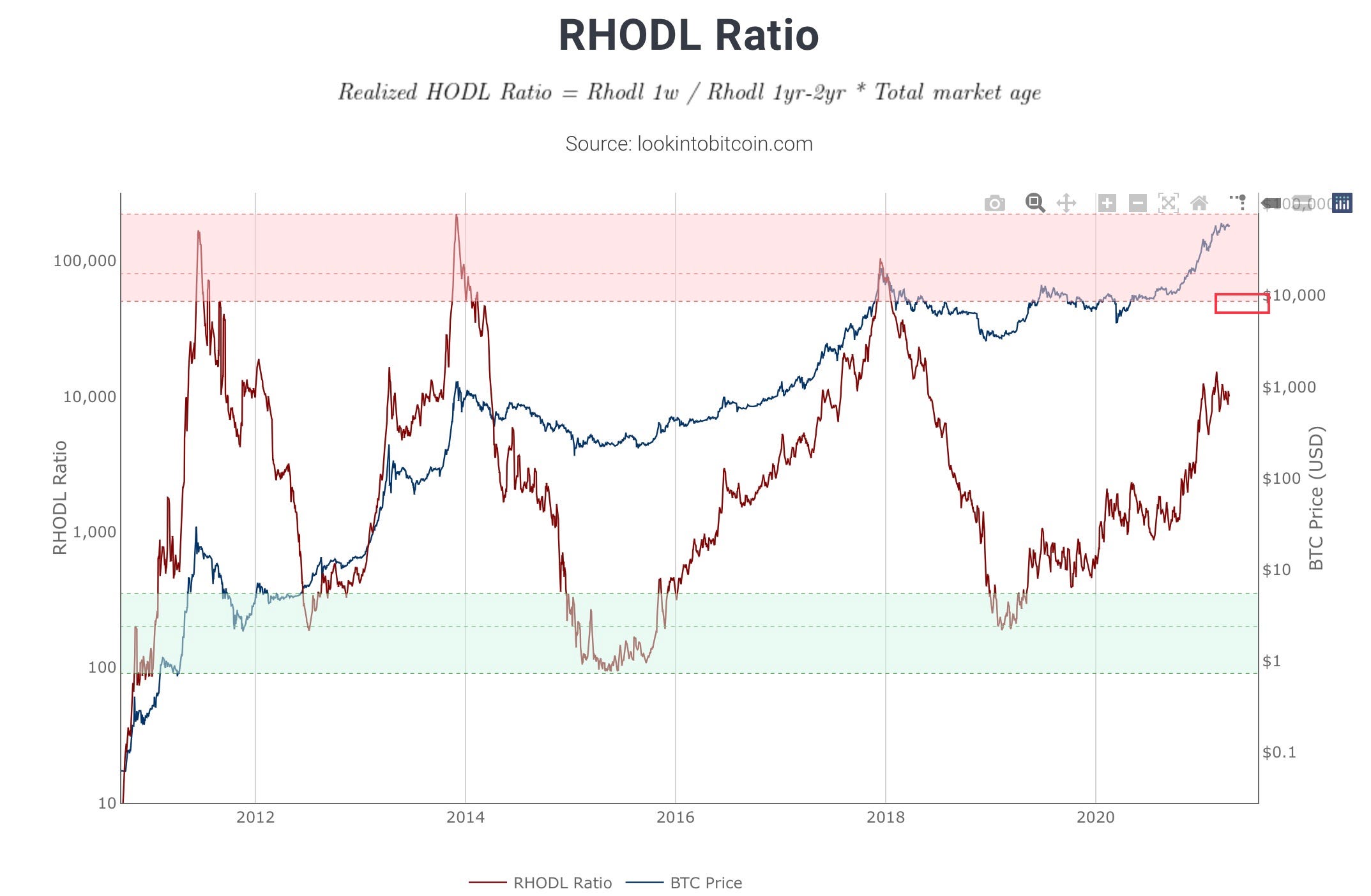
The last metric I will include is the RHODL ratio. This shows good periods to buy and sell based on who is holding the majority of Bitcoin. When the indicator moves into the green band it is signaling that Long term HODLers are holding the majority, indicating a good place to buy, while the red zone shows that shorter term holders have the majority of bitcoin, indicating a much riskier time to hold and good time to sell.
I have used these types of indicators in the past to try and get an idea of where we are in the cycle compared to others, however I think with these metrics, it is a little in-effective due to the highs and lows being in dramatically different places.
I have mentioned on Twitter but I am going to reiterate here, everyone is watching these indicators. This time will be much different in that almost all of these indicators were created after the 2017 top, making this the first time where data is easily accessible to gauge the top. Everyone wants to sell the top, I see many YouTubers claiming they will sell the top, because of how long they have been in crypto. Unless you can call every single Bitcoin move with accuracy, it’s unlikely you’ll sell the exact top. The goal is to try and get as close as possible, while also securing your gains.
I expect that this indicator will likely only briefly touch the red zone, as many different holders will be competing to sell. Using a combination of many different metrics will help you secure as much gains as possible. It is important to learn to be happy with however much you make, rather than feeling like you miss out if price continues to run, because greed will cause you to hold through another bear market.
This will be very difficult mentally, as most bitcoin influencers will not be saying the top is in when it is, rather saying that it will double the current price. Stay focused on the data. Sell when you are convicted. I will continue to provide my analysis so that you can make the most informed decision, and I encourage you to check my work and analyze the data for yourself.
IN CONCLUSION…
The Heatmap, HODL waves, and Active Addresses show we are likely at a point similar to Early October 2017. This implies that a top could be about a month and 1/2 away or late May/ early June for the Macro cycle top.
Everything is always subject to change and will be based on whether or not indicators continue to perform similar to past cycles. I will continue to update my prediction as data evolves.
Thanks again for reading and I look forward to the next Newsletter update!
HODL on,
CryptoCon