

Bitcoin Data Newsletter #1
Bitcoin Corrects, What That Means For The Cycle

Things have been looking pretty bearish for Bitcoin lately, as it had just hit fresh ATH’s close to 62k, it has now corrected to prices just under 52k.
This seems to be a good thing however, considering how close the Puell Multiple, and MVRV-Z score indicators are getting to over extension .
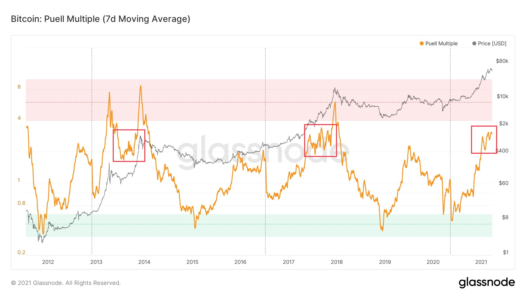
The Puell Multiple shows periods where Bitcoin miners are either producing undervalued (green box), or overvalued (red box) coins.
Although this metric did not block out the first Bitcoin top of 2013, something I’d consider to be a fake top, it has been advantageous to sell during these times of overvaluation.
The red boxes show periods where Bitcoin spends its time right before its parabolic final top, and entering the red zone. When Bitcoin enters this area, it usually only spends a matter of months before the final extension.
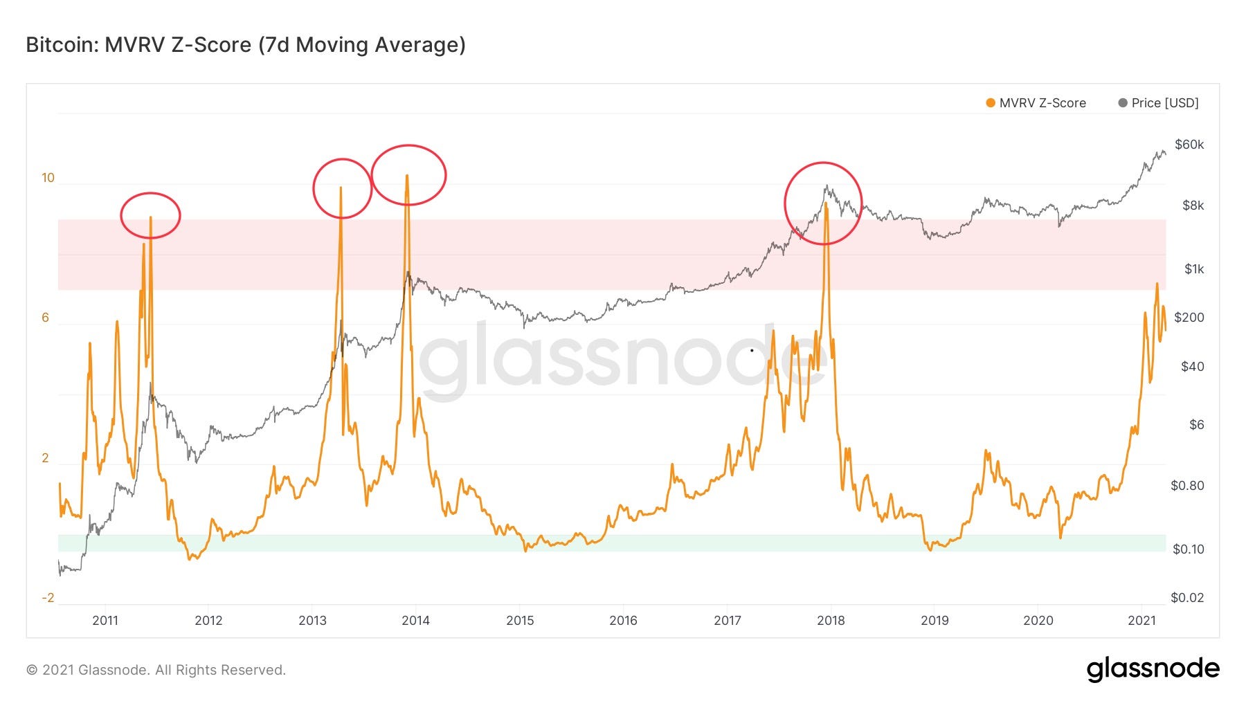
The MVRV-Z score shows something similar to the Puell Multiple nearing the red zone. This metric uses the realized price, to find a fair value for Bitcoin, and in turn show periods of over and undervaluation (red and green zones).
This metric also did not block out the first top of 2013, but has shown advantageous to sell in the red zone
So far all tops have been over top the red zone, which is still a decent ways away.
However, as can be seen clearly, Bitcoin can go parabolic very quickly leaving not much time to react when price does go over the red zone, so this might not be as far as we think.
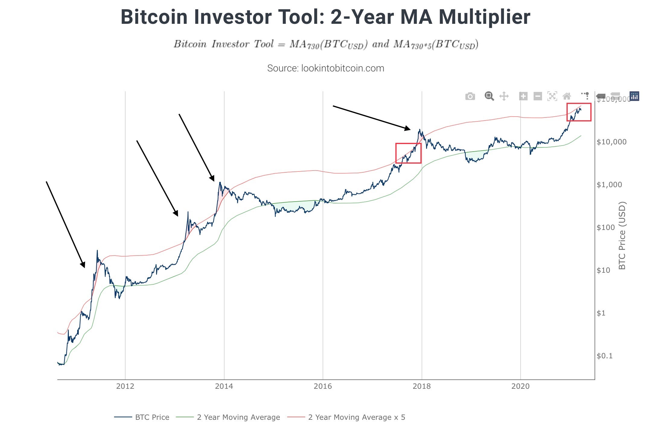
The 2 year MA multiplier is an indicator I watch closely, as it as been accurate at judging the start of every parabolic Bitcoin run.
This metric takes the 730 Day Moving Average (green line), and the 5x multiple of that (red line). This has historically shown good periods to buy and sell.
Personally, I will likely be looking to transfer my Bitcoin to an exchange from BlockFi shortly after Bitcoin crosses above the red line, as this has historically been a good idea, and would have given me plenty of time for the transfer and being prepared to sell.
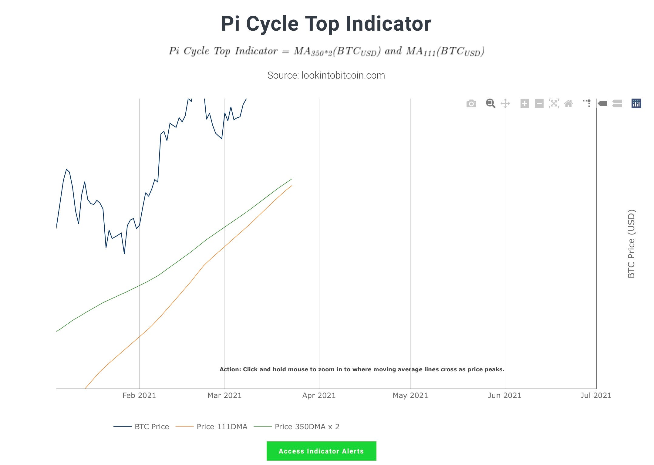
The Pi Cycle Top indicator is getting very close to crossing, at only about $1000 apart. This could mean a cross could be coming in only a couple weeks, but will that be the top? I don’t think so, and here’s why.
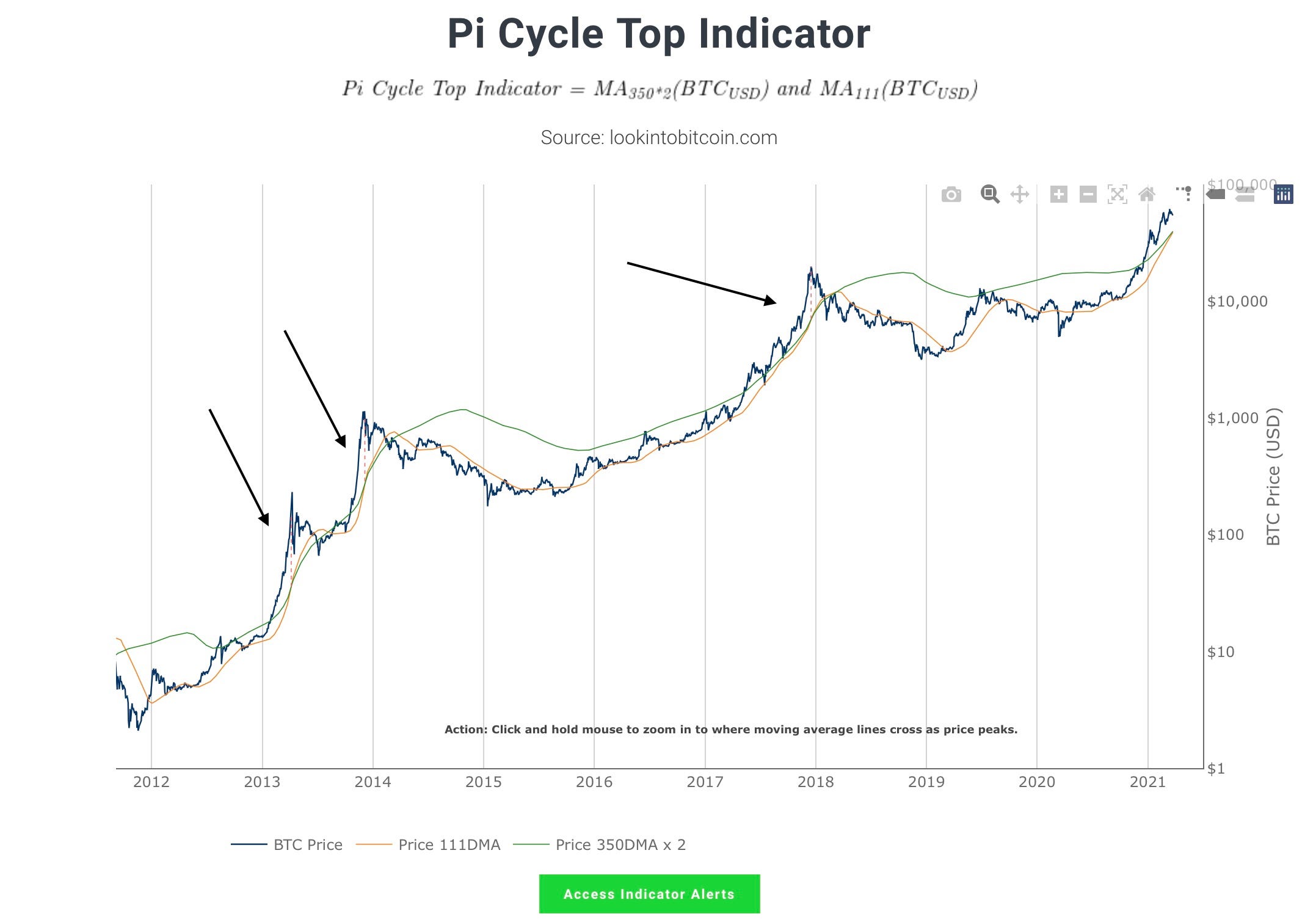
This indicator is just 2 moving averages that, when cross, have come very close to the Top the past 3 tops, including the fake 2013 Top.
This indicator was created after all of these tops passed, so this cross will be the first real world test.
It reflects no on chain data, and is just 2 moving averages. If no other indicators are showing over extended it is likely that this one has failed, which is why I am not including this in any of my exit plan
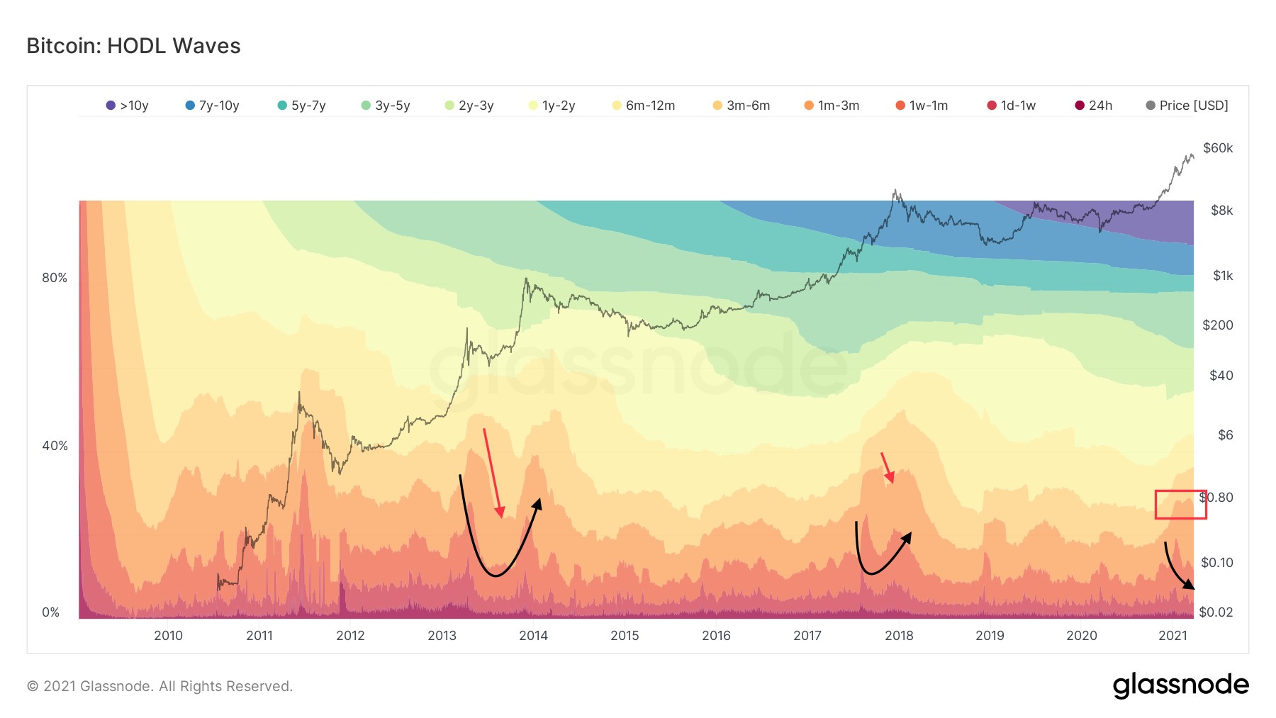
The Bitcoin HODL waves can give us an idea of where we are in this Bitcoin cycle
The HODL waves show different groups of coins of different ages, and whether they are being saved or spent. Moving to the top shows spending, while moving to the bottom showing saving.
I have observed a pattern of a double top, with the second lower than the first in the HODL waves (black arrows). Currently I am paying close attention to the 1-3 Month wave (red box), as when the wave started to dip it showed the final accumulation of coins by the 1-3 Month age group
Last cycle, this wave started its downwards dive 2 months from the top, and it looks like its possible that’s happening now, but not confirmed.
Other waves are also Mimicking the bowl like shape formed in previous cycles, moving to the bottom of the “bowl” which also happened 2 months out from the top.
This might mean we could see a top in May of this year
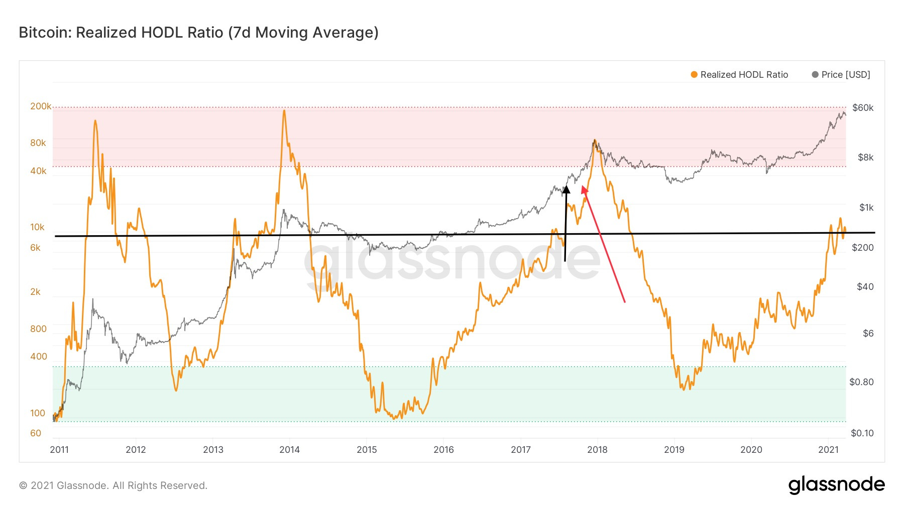
The RHODL ratio shows periods where Bitcoin is in the hands of longer term holders (green) and shorter term holders (red). This indicator did block out the fake run in 2013, so it is more respected to me.
This shows we at a similar point to August 2017, 4 months before the top
However, the data is reading different this time, and I believe we are closer to a point like September 2017, 3 months before the top.
It is possible that this indicator only touches the red zone, and does not go as high as previous cycles, which I think will be the case based on other indicators.
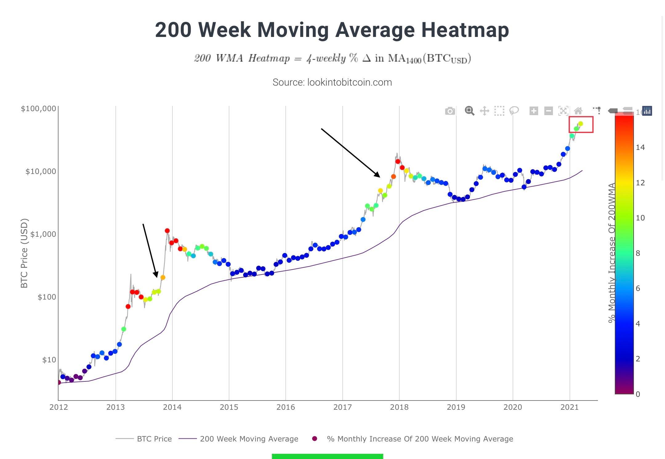
Lastly we look at the 200 Week Moving Average Heat Map, which I have touched on, on Twitter
This indicator shows how quickly the 200W moving average is increasing, with red showing a maximum of 14% Monthly increase
A green yellow dot just appeared, which has appeared 2 times before, once 1 month before the 2013 top, and again 2 months before the 2017 top.
According to this we could be 1-2 Months out from the final top
In Conclusion…
Some indicators like the Puell Multiple and MVRV-Z score are showing close to over extension, but other indicators like the RHODL ratio that blocked out the first 2013 top are showing there is probably months left to go
The Pi cycle top indicator has been good in the past, but is under going testing and seems unlikely to perform well looking at other respected indicators
Analyzing all indicators together, seems to put a top about 2 months out
This of course is dependent on corrections, and how fast bitcoin moves from here
Thanks for reading! If you enjoyed consider subscribing. Your feedback will determine whether I continue this or not.
HODL on!!
,CryptoCon
Thanks for the feedback Andrew! Hope to continue this in the future
Good analysis! Much appreciated